Update: Some Things Bleak has been selected as one of the Best Book Designs of 2022 by the professional jury of The Best Dutch Book Designs!
Texts by Charlott Markus and Sophia Seawell
Designed by @hans.gremmen and printed by @zwaanlenoir
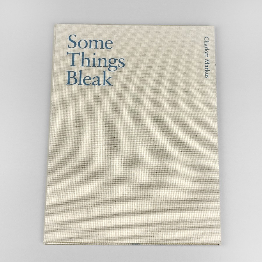
Some Things Bleak is published by @fw.books and distributed by @ideabooksnl
2022, Edition 500, Pages 80, 24x34 cm, ISBN: 9789083165875
BUY BOOK HERE
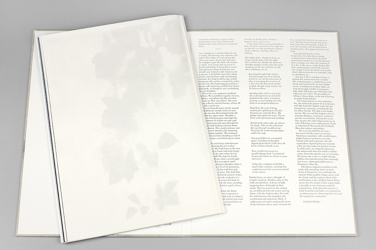
Some Things Bleak, a publication about seeing versus not seeing, in respect to gender, class and climate, and a work about representation and reproduction. In short, a poetic vehicle for perception and togetherness.
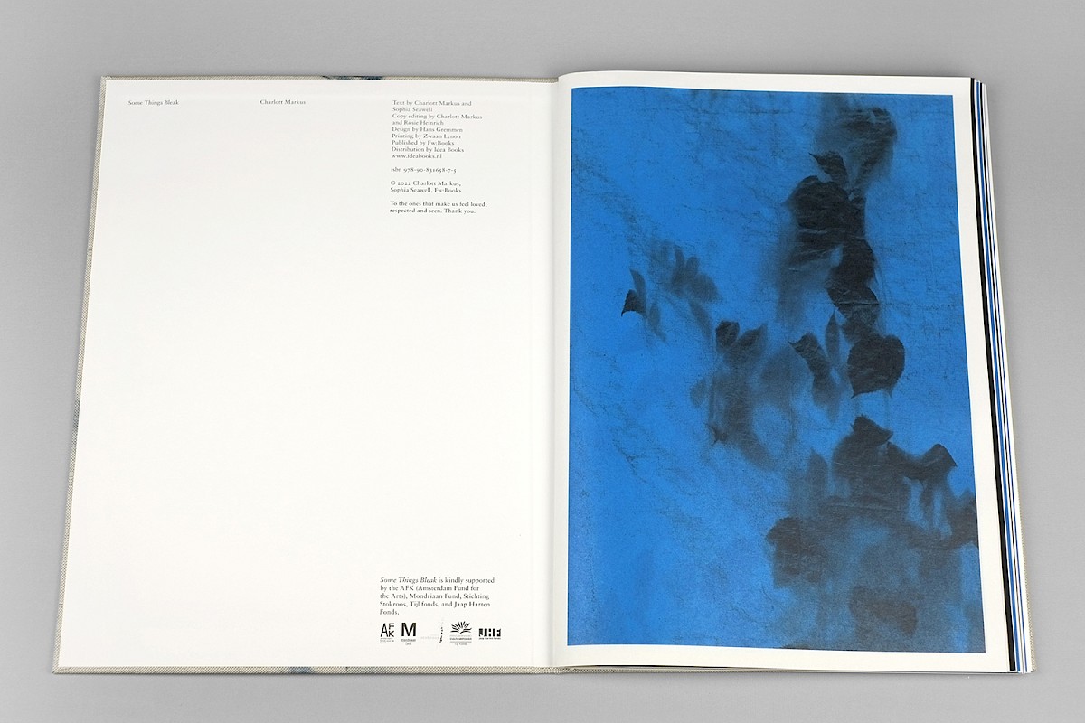
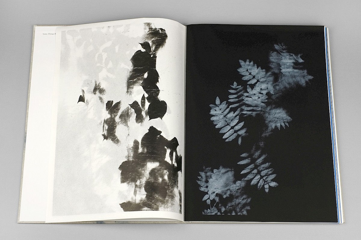
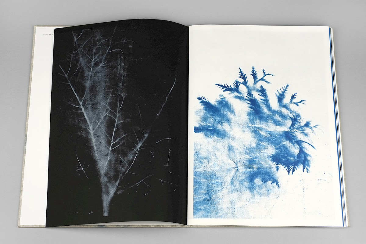
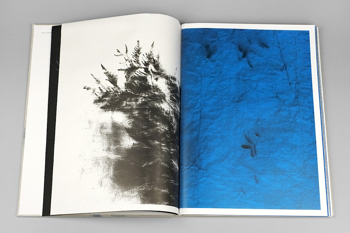
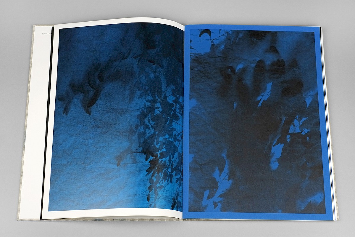
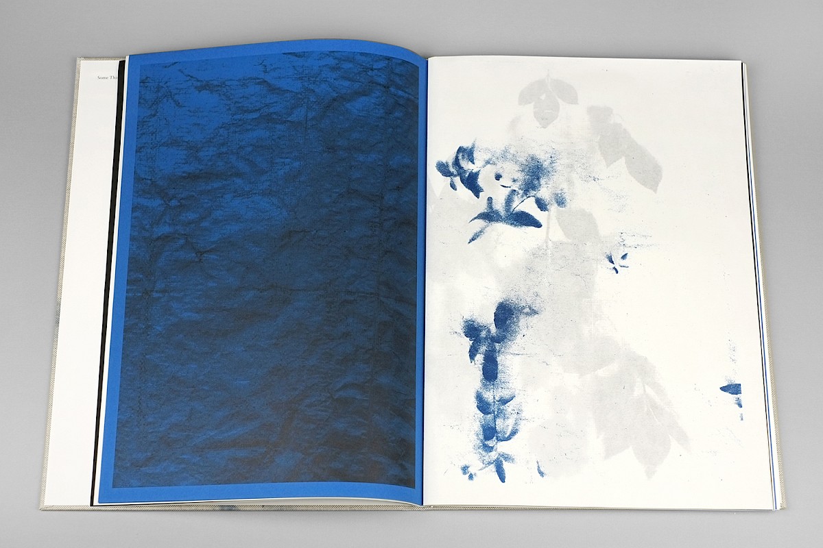
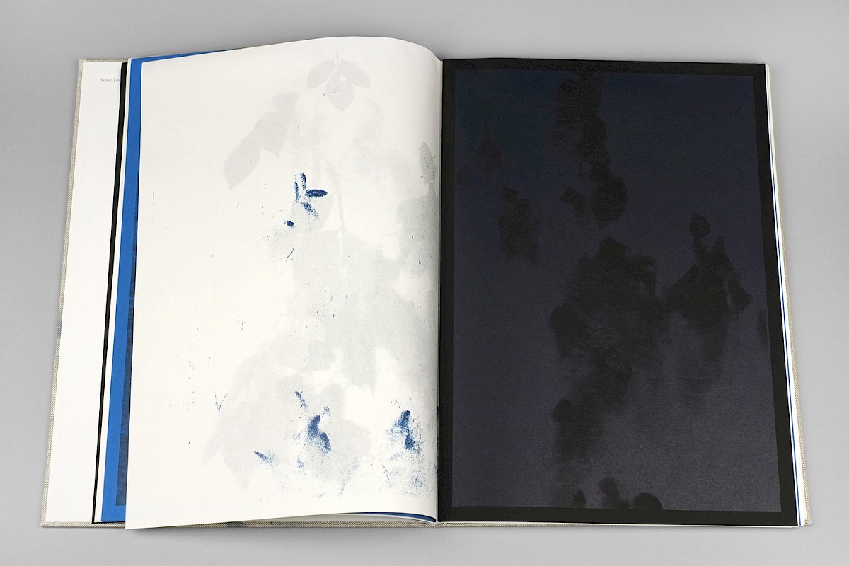
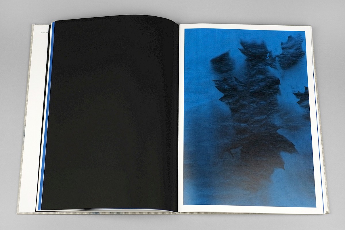
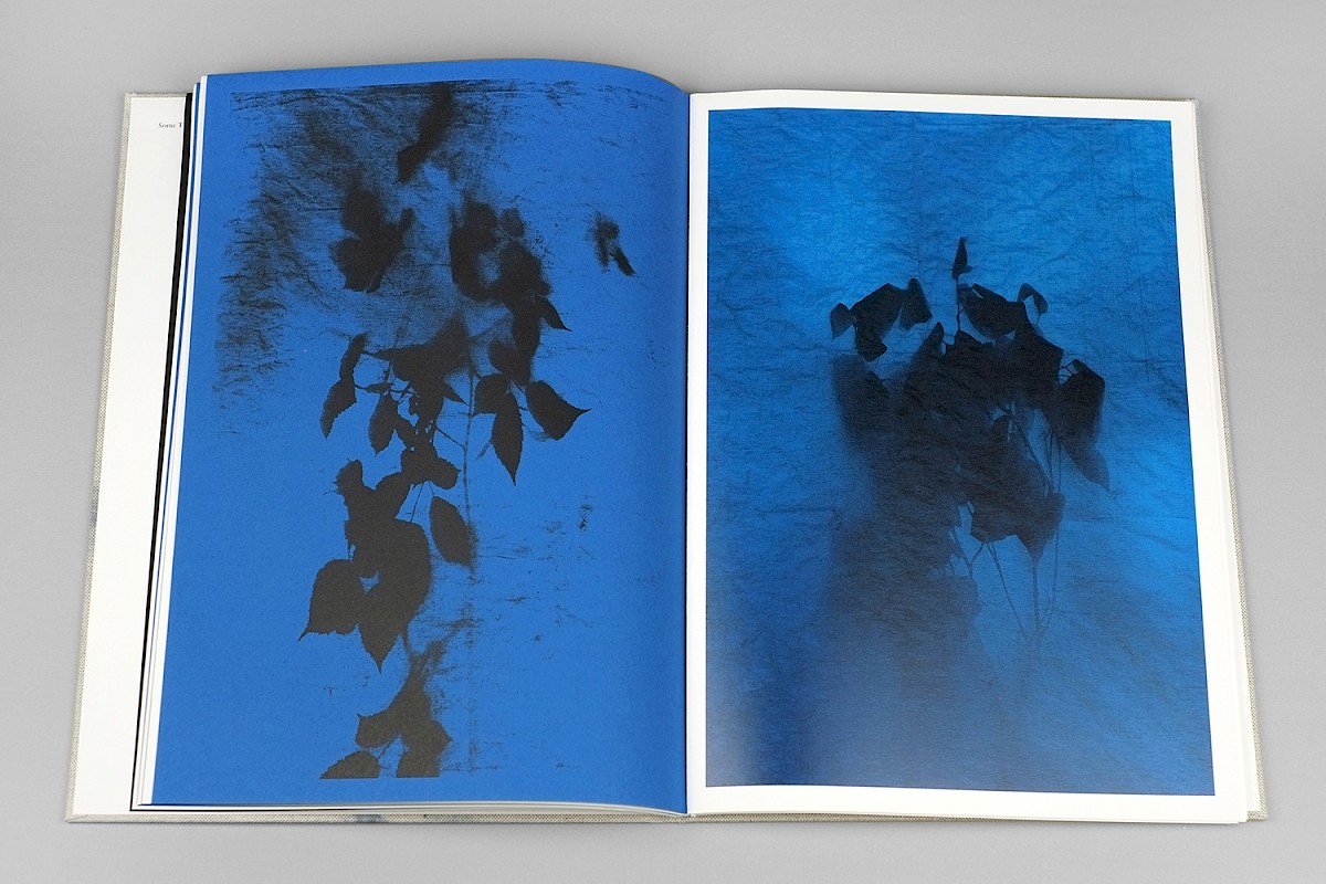
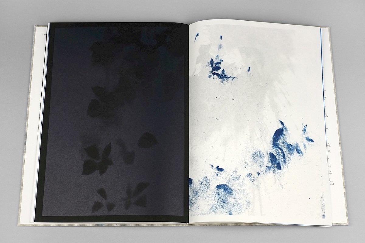
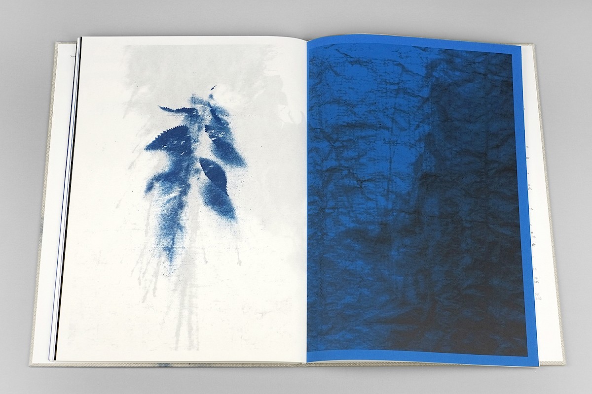
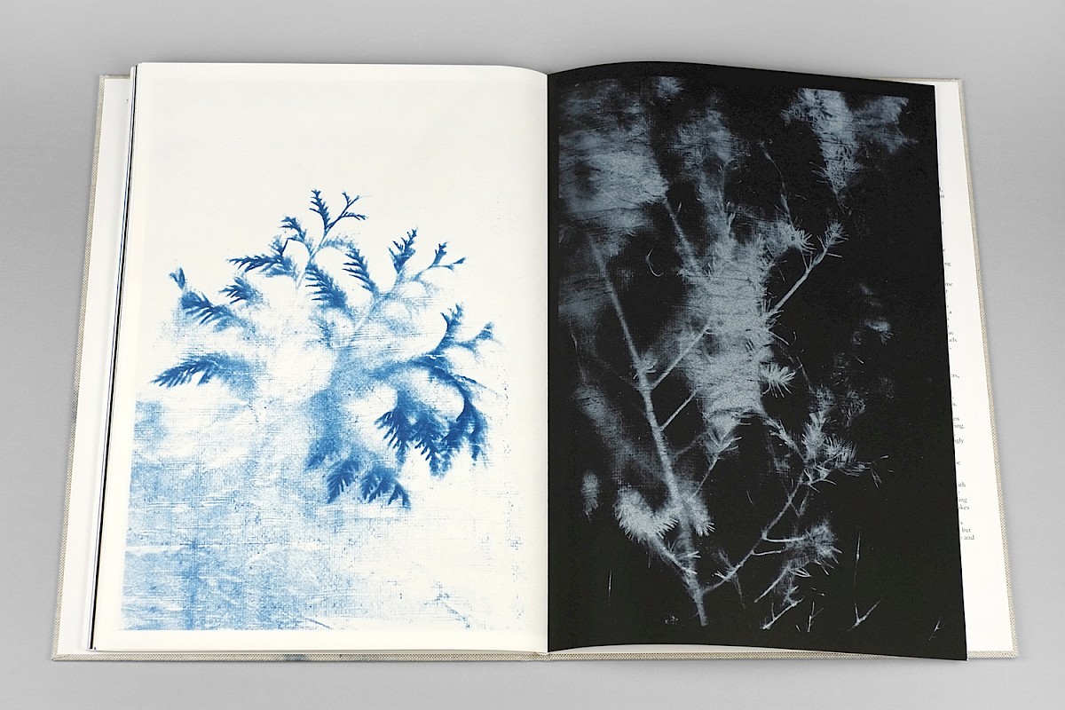
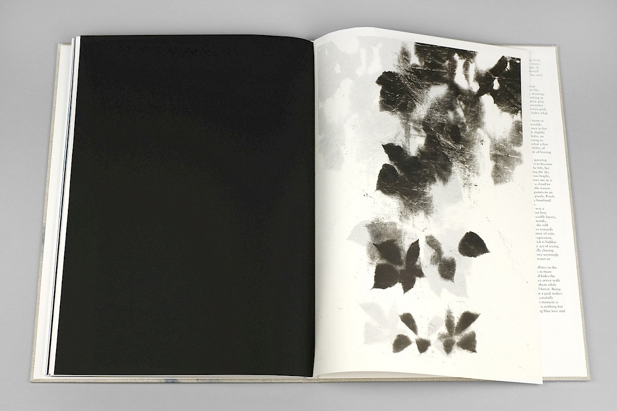
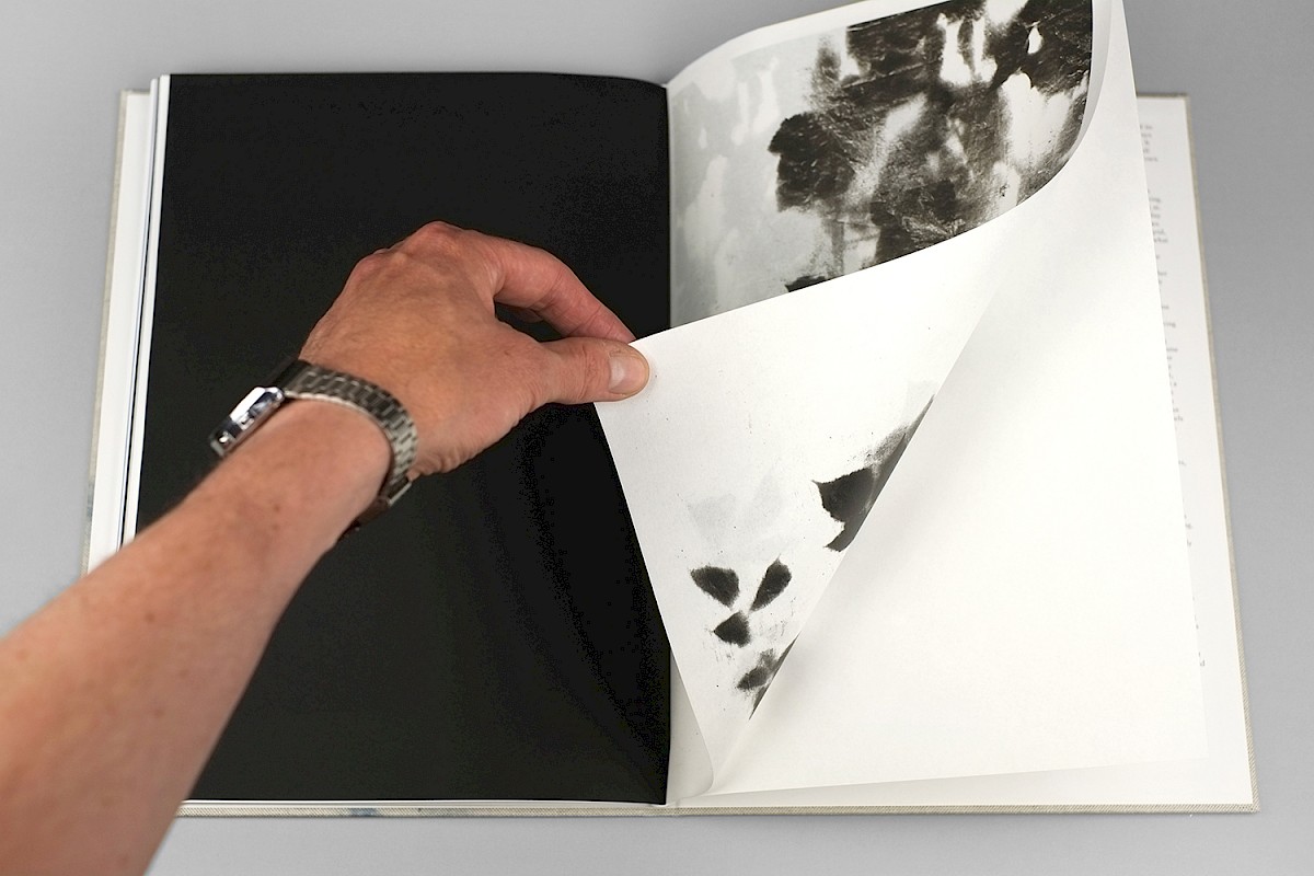
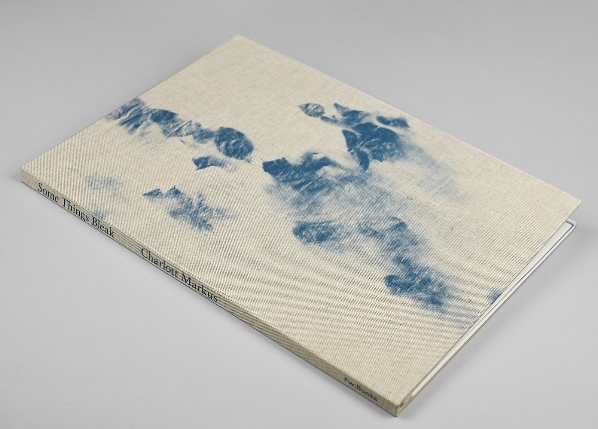
After leaving an artist in residence in Japan spring 2019 and being back in Amsterdam Markus felt the need for silence and contemplation. Intuitively she built a studio setting in the forest and a photographic process began. It started with a found tarpaulin; the same kind of blue tarp that is a common sight in Japan and if one looks closer most often a shelter for someone without a home appears. The same familiar blue patches that we see in Europe on building sites and in gardens, a weave that shelters from the wet and hides what we should not see. Using the sun as the only light source plants were photographed through the weave resulting in images seemingly being at sea, being under water or floating in a blue sky. Yet it is only a woven blue plastic piece that hides what is right in front of us. It blocks our view and hides the natural. A deception. An illusion.
Parallel to honoring artistic writing such as calligraphy and Rorschach tests these images also reference cyanotypes, the first photographs ever made. When one looks closely, the woven blue grid in the tarp resembles the fleeting never-ending digital pixels that swirls around us in our everyday life. The images are poetic and at the same time a bleak abstraction of nature, representation and reproducibility. Some Things Bleak is a poetic summary of the artist’s thoughts and layered methodology, simultaneously the work highlights intersectional views in both the texts and in the metaphor of the printing process.
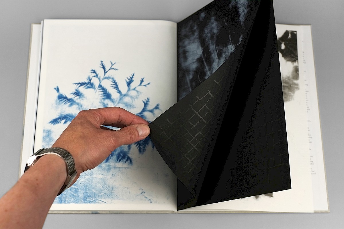
This publication is more of an artwork than an actual book. A hardcover that contains loose sheets, which all have been folded into separate folders. Folders that can be democratically taken out and be used as separate artworks. Three colors give the publication its identity, white, black and blue, which are combined in both paper choices and in different layers of ink, transparent and opaque alike.
This project is made possible with the kind support of AFK - Amsterdam Fonds voor de Kunst, Stichting Stokroos, Tijl Fonds via Prins Bernhard Cultuurfonds, Stichting Jaap Hartenfonds. and Mondriaan fund
Documentation of the publication is made by Hans Gremmen / Fw:books.